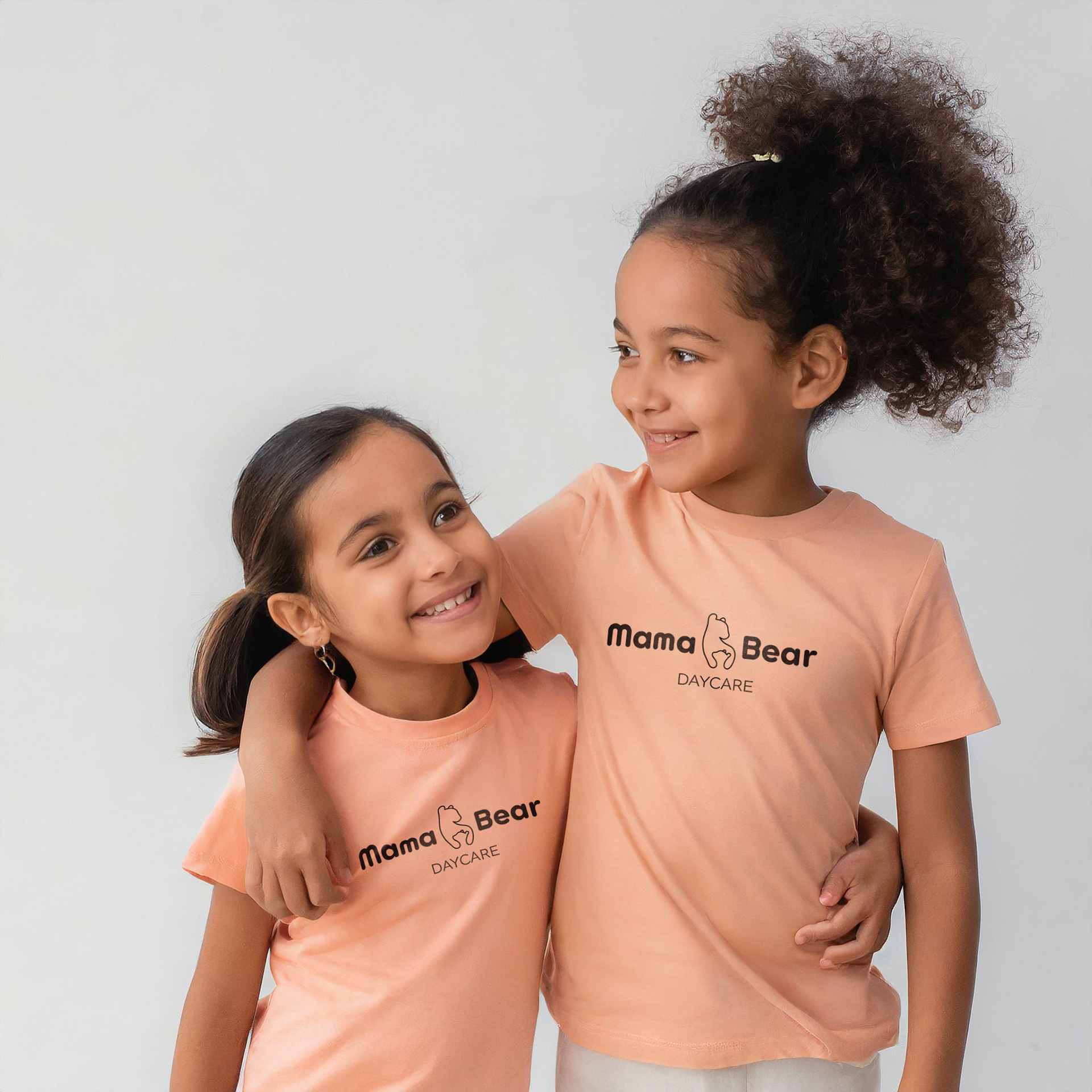
Mama Bear Daycare is dedicated to providing top-notch childcare services for children aged 2-6 years. Known for its warm, home-like environment, the daycare combines educational and play-based activities to foster growth and development in a nurturing setting. The facility is designed to ensure comfort and safety, offering cozy spaces and a variety of engaging and age-appropriate resources.
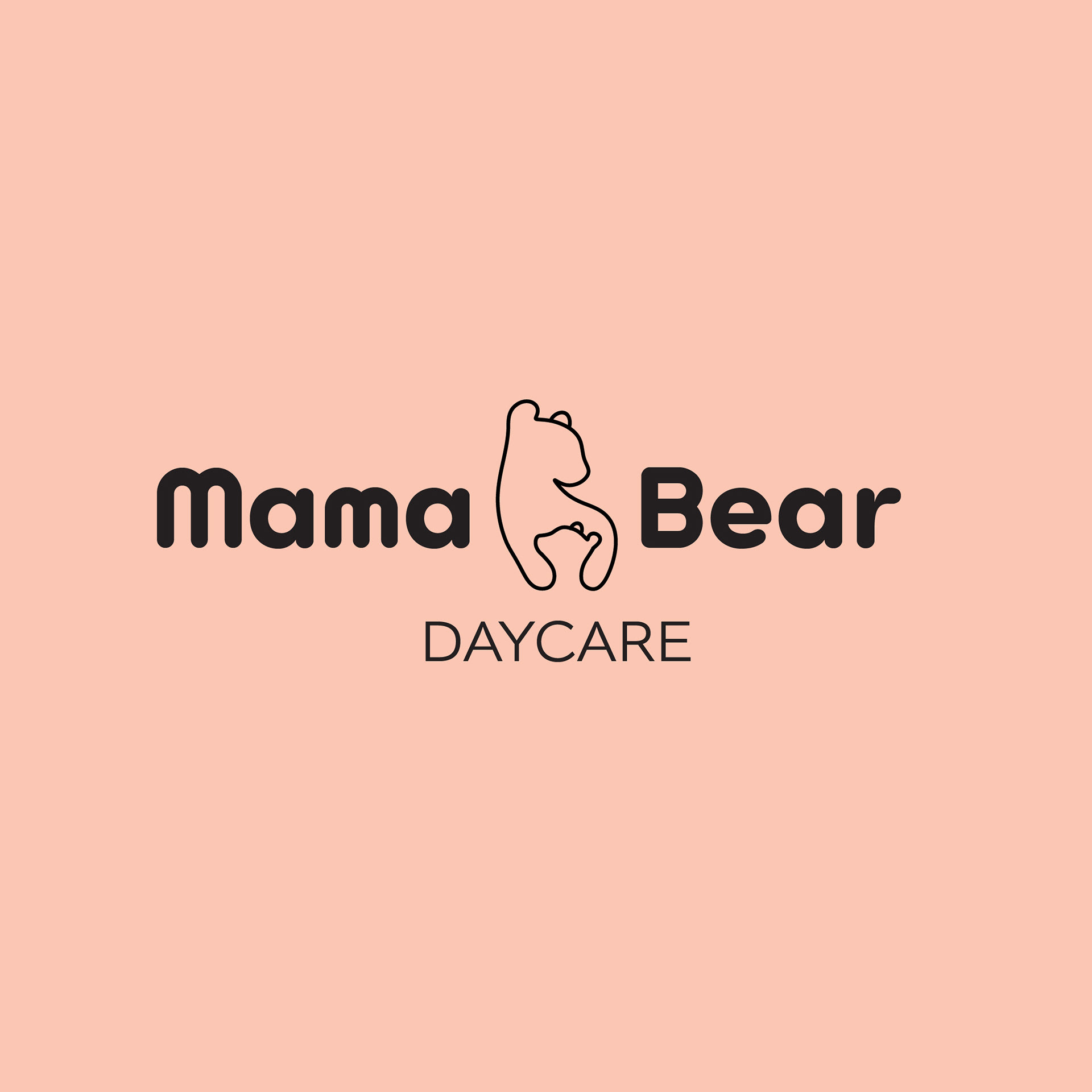
The Mama Bear concept draws its inspiration from mother bears, known for their nurturing and protective instincts towards their cubs. Reflecting this, the logo cleverly employs the Gestalt principle of figure and ground to depict an outline of a mother holding her cub, symbolizing care and security.
For the typography, I selected a rounded font to convey a soft, loving, and welcoming atmosphere suitable for a daycare setting. "Mama Bear" combines the fonts Sofia Pro Soft and Arista 2.0, both of which feature the rounded characteristics I was aiming for. To provide a subtle contrast to the boldness of these rounded fonts, I chose Altivo Light, which offers a lighter, more refined touch.
The color palette is anchored by a light peach, chosen for its ability to evoke feelings of peacefulness, innocence, and soothing comfort, aligning perfectly with the nurturing theme of the daycare.
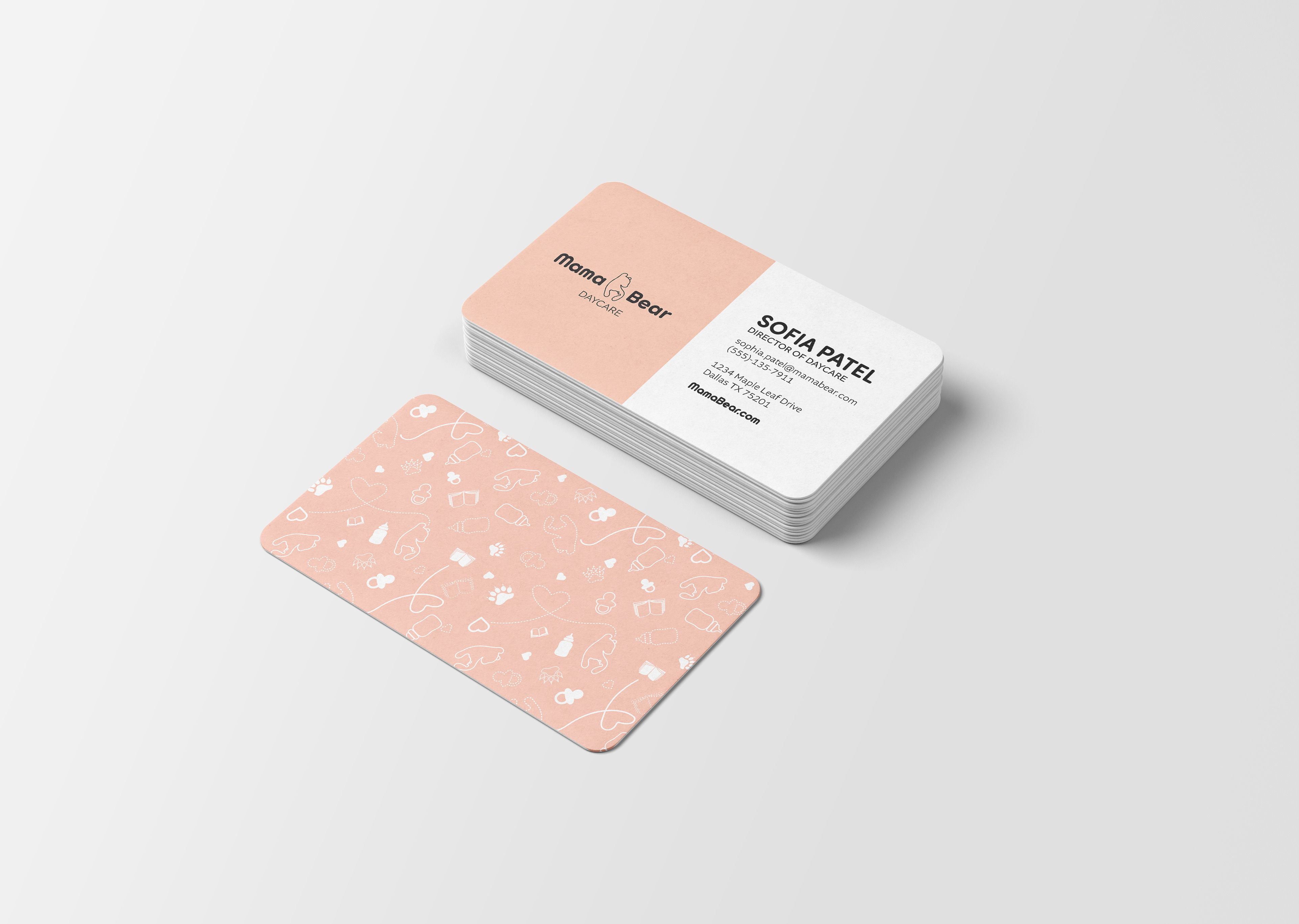
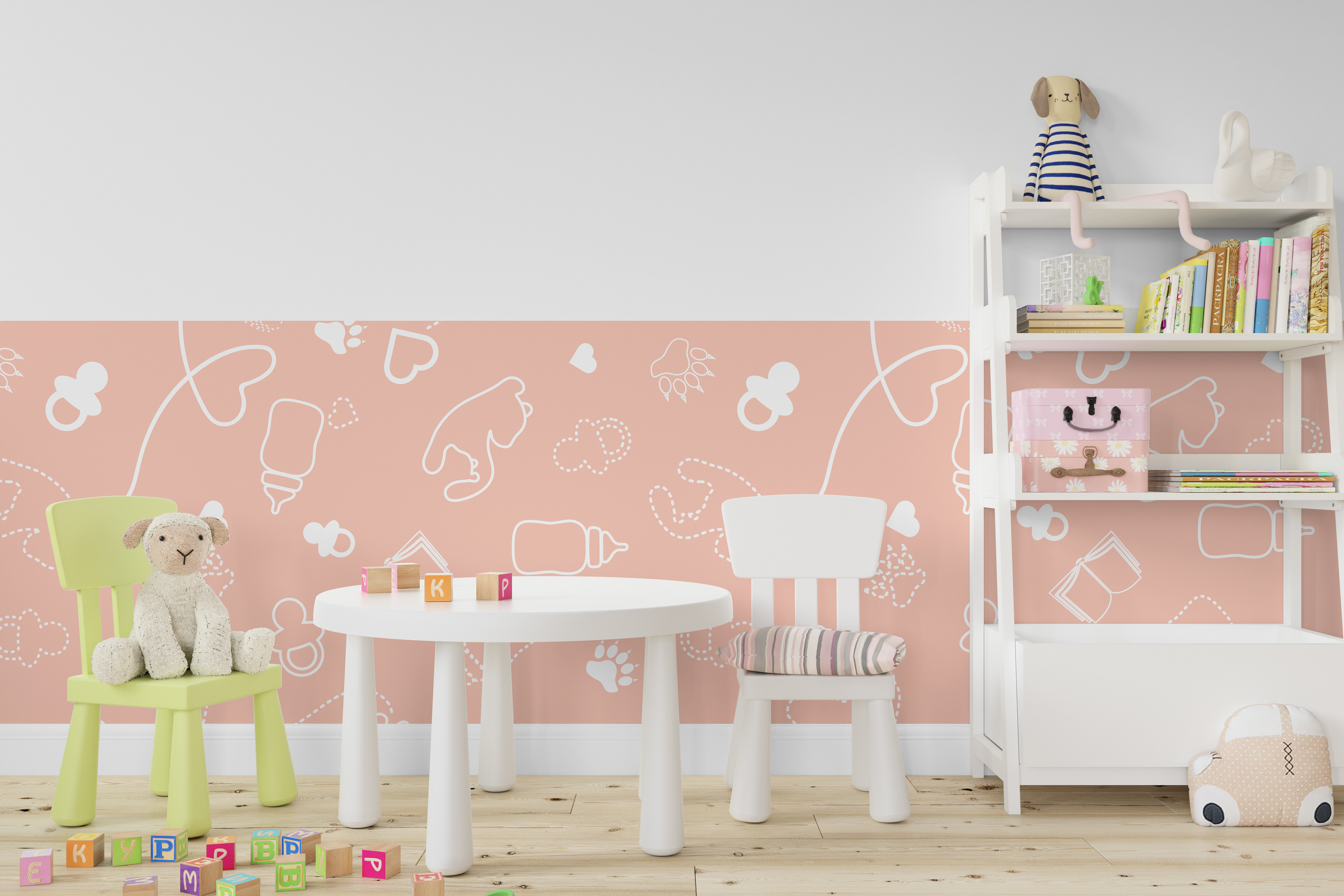
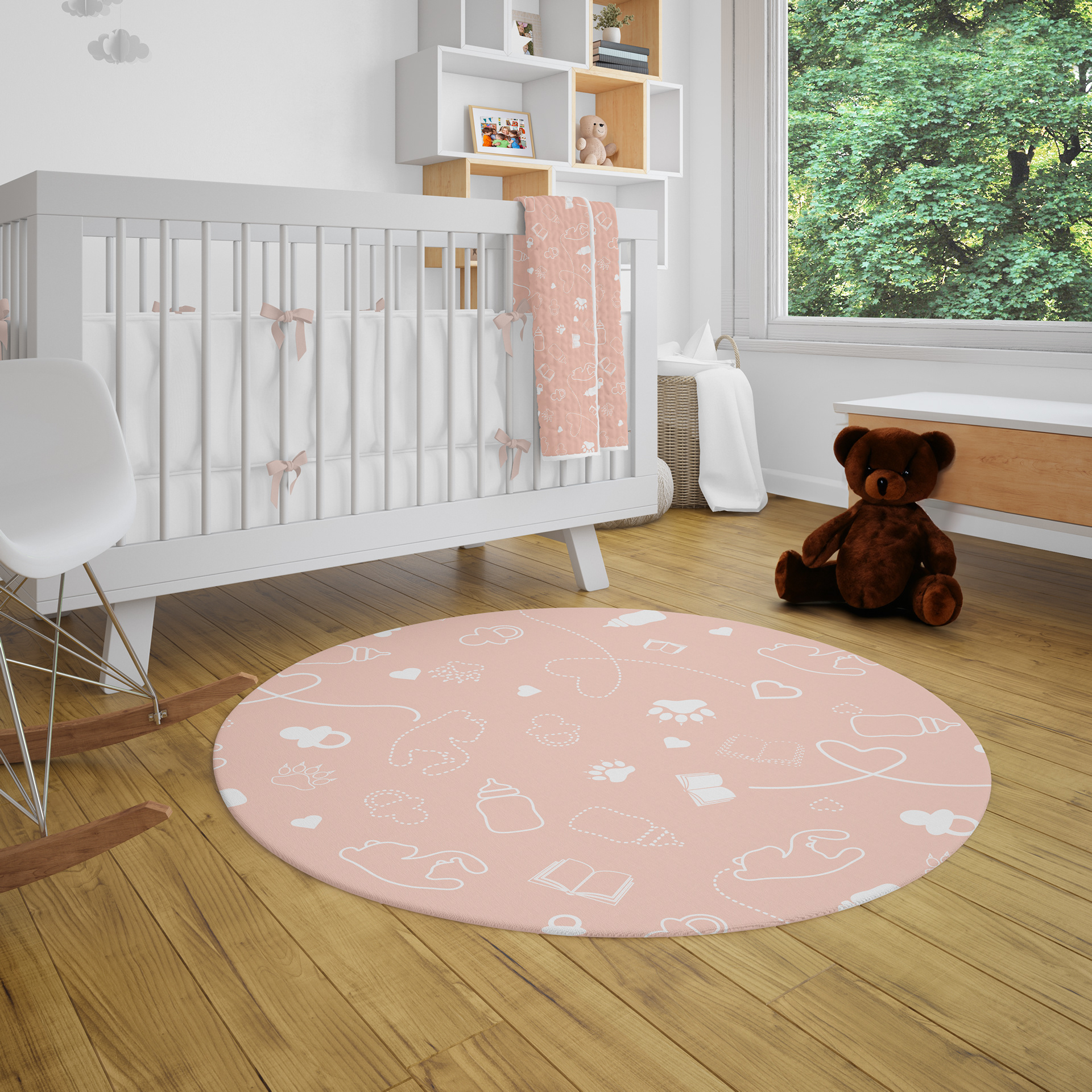
To complement and reinforce the branding of "Mama Bear," I designed a distinctive pattern that serves as a secondary visual identity. This pattern, highlights the nurturing theme of the main logo, it combines charming icons of daycare essentials—like bottles, pacifiers, and books—alongside affectionate hearts, showing the loving care central to the brand's ethos. Prominently featured on the reverse side of my business cards, this design element provides a unique and memorable touch. Moreover, the pattern's versatility allows for its potential application across various other elements, such as accent walls and decorative details, further unifying and enhancing the brand’s visual presence in both physical and digital spaces.